Richard McGavigan, Head of Digital at Penna/Stafford Long
Here at Penna, we pride ourselves on making our client's offerings the best they can be. This includes making sure accessibility is at the forefront of our thinking from the project's outset. Our in-house experts are involved from the initial brief, user experience, and design, through to delivering the live website and its continued development.
Being involved this early in the process allows our team to inform the design with accessibility as a priority. We can tackle how we deliver content to all users, ensuring we reach the widest audience possible; how users can interact in an engaging way with the website, and the most exciting part; how far we can push our knowledge and the boundaries of accessibility.
That last point brings up the common misconception: “Accessible websites are ugly and functional”. This is not true at all, or at least, they don’t have to be. Yes, there may be some restrictions on the type of interactivity we can use, such as any third-party plugins or tools that are traditionally utilised, but this is where the excitement comes in. If the regular approach doesn’t work, then it’s time to figure out how else can we do it. By including Creative Developers in the process from the outset, there is the opportunity for some great innovations and alternative thinking that can tackle what at first seems like a big problem.
Penna offers accessibility consultancy advice to clients, providing them with them the most effective ways to improve existing websites and content along with technical audits to share with their internal development teams. We recognise that not everyone has the budget, resources, or time to build something new, so we created a service that blends well within the constraints of existing systems. There will always be ‘quick wins’, however, we consistently work to ensure a website operates to the required compliance level. With the regulations in place that hold public sector website owners accountable for inaccessible content, it is imperative that full compliance is reached.
If you would like a website that provides accessible content for everyone, there are many simple things you can look out for, including:
- Video content. One of the most engaging yet overlooked pieces of accessible content, we always advise providing videos with subtitles, captions and transcripts as a standard, and where appropriate, generating an audio descriptive version as well.
- Colour contrast. Whilst the brand of the organisation is important, if the website or creative advertising cannot be read due to the text being too small or against a background with an inappropriate colour, this will have a detrimental impact. Consider making simple adjustments to background colours or font size and spacing, as this can instantly make content more accessible to users.
- Text over images. This one has a simple answer: - just don’t do it. Well, at least not directly. Put a background block behind the text and instantly a difference is made. It’s a simple and less stylistic solution, but it does work.
There are other, far more complex implementations that require web development teams, and these should not be underestimated. Platform limitations can play a big part in whether a website can be made fully accessible, and it is important to engage development resources as early as possible. As appealing as quick wins can be, they will not solve the more technically challenging failures in accessibility.
The websites we build are checked by an independent third party to ensure compliance with the latest WCAG standards, giving Penna and our clients the reassurance that everything is compliant and that users will be able to access content in whichever format or interaction they require.


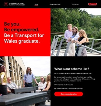
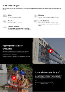
An example of this process in action is exhibited by Transport for Wales (TfW) https://tfwearlycareers.wales/. TfW enlisted Penna’s help for a creative campaign and supporting website to attract talent to their graduate roles. Not only did it need to provide multiple languages (English and Welsh), but there was also a requirement for the website to meet the web content accessibility guidelines (WCAG 2.1 AA) standard.
With the brief clearly defined, accessibility was key during the design phase of the website and content generation. Everything from branding, imagery, video creation and page layout went through both the Designers and Developers before the clients reviewed and the website was built. Additional work was required to make the multi-language website meet the standard. Once built, the website went through a review by an independent third party to ensure it was compliant before it was released in time for the campaign start date.
In addition to providing accessible platforms for websites, Penna also provides the same service for online candidate assessments. We ensure that our custom assessment platforms comply with reasonable adjustment requirements through to alternative formats to ensure that no candidate is at a disadvantage.
Penna also produces and distributes social media content for our clients across all platforms, including setting up visually accessible static and video adverts. Other social media settings such as alternative text and descriptions are provided as part of the service, ensuring that clients are keeping up to date with newly released features.
So, don’t settle for ugly and traditional. It is possible to have a colourful and accessible website and advertising creative that allows service users the best experience possible. If you would like to find out more about what Penna can do for your digital services, contact us at Richard.McGavigan@penna.com for a consultation.


